Art Reflections
Art Date 101: A Guide To Help You Mingle and Talk Art on a Date Part 3
 There is is a type of flow that goes with getting along that you shouldn’t just make sure you have on dates or in relationships. Harmony is a principle of art important to composition, too, and if you can talk about Harmony with your date, you might just see him or her for a second one.
Harmony can be defined as a pleasing arrangement to the eye, in the most simplest of terms. It engages the viewer and creates a recognition of balance within the individual–the perfect balance where you don’t feel under-stimulated or overstimulated. Colors that are harmonious work well together on canvas and feel attractive to the eye. There are various types of color arrangements used on the color wheel to achieve a feeling of harmony. Let’s begin with the most four commonly identified:
According to artdesignweb.com, here is more oncolor relationships:
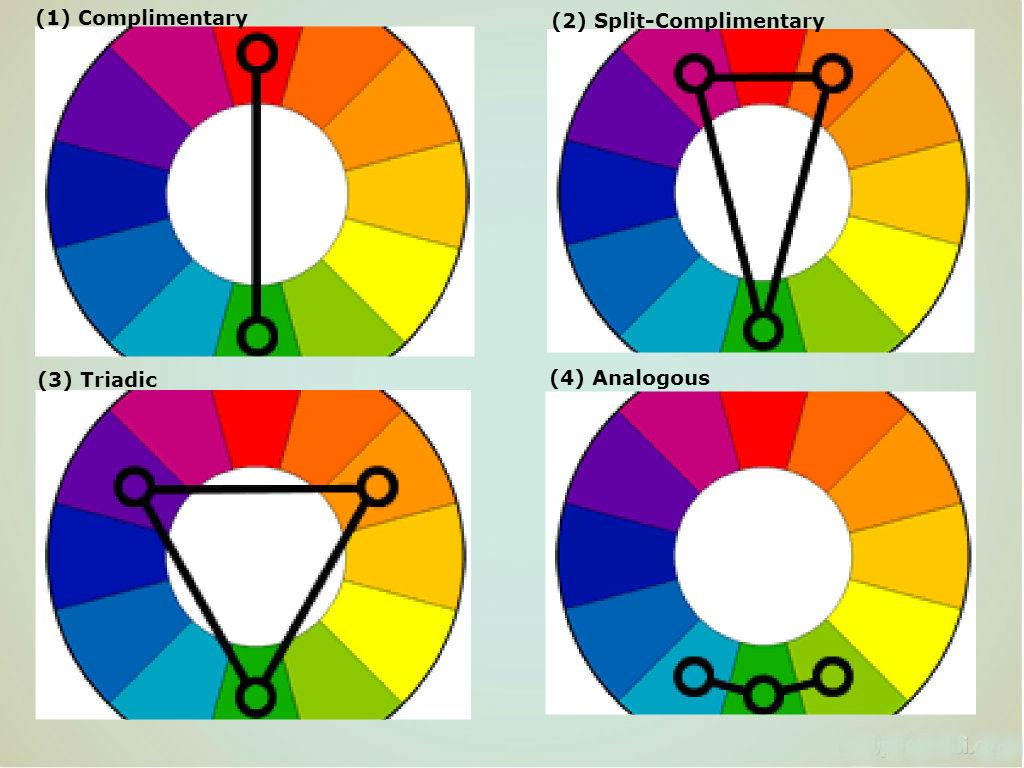
- Complementary colors are colors directly across from each other on the wheel. These are typically colors that will produce a strong contrast.
- Split-Complementary colors are those on either side of a complementary color; these colors contrast, but not as strongly as complementary colors.
- Triadic colors represent three colors equidistant on the color wheel; this typically provides a balanced color scheme with reasonable contrast.
- Analogous colors are colors next to each other on the color wheel. They typically harmonize well but may not provide enough contrast, and are perhaps best used in conjunction with a complementary color. Monochromatic colors are all shades and tints of the same color.
There are also four harmonious color formulas that are commonly recognized:
- The Monochrome color scheme is derived from a single base color, using just one hue. This single color is extended by using its shades and tints (that is, a color modified by the addition of black and white). As a result, the energy is more subtle and peaceful due to a lack of color contrast. Monochromatic colors offer very little contrast and may be considered boring unless there is diversity within the design.
 Composition of the painting or art work is achieved entirely through adjusting saturation and tones. Although limited, monochrome colors can be a powerful approach.
 - The Analogous formula is characterized by combining three of the colors which are side-by-side on a 12-part color wheel. An example of this would be to use green, yellow-green, and yellow. In most cases, when using an Analogous color scheme, one of the three colors usually predominates.
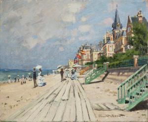
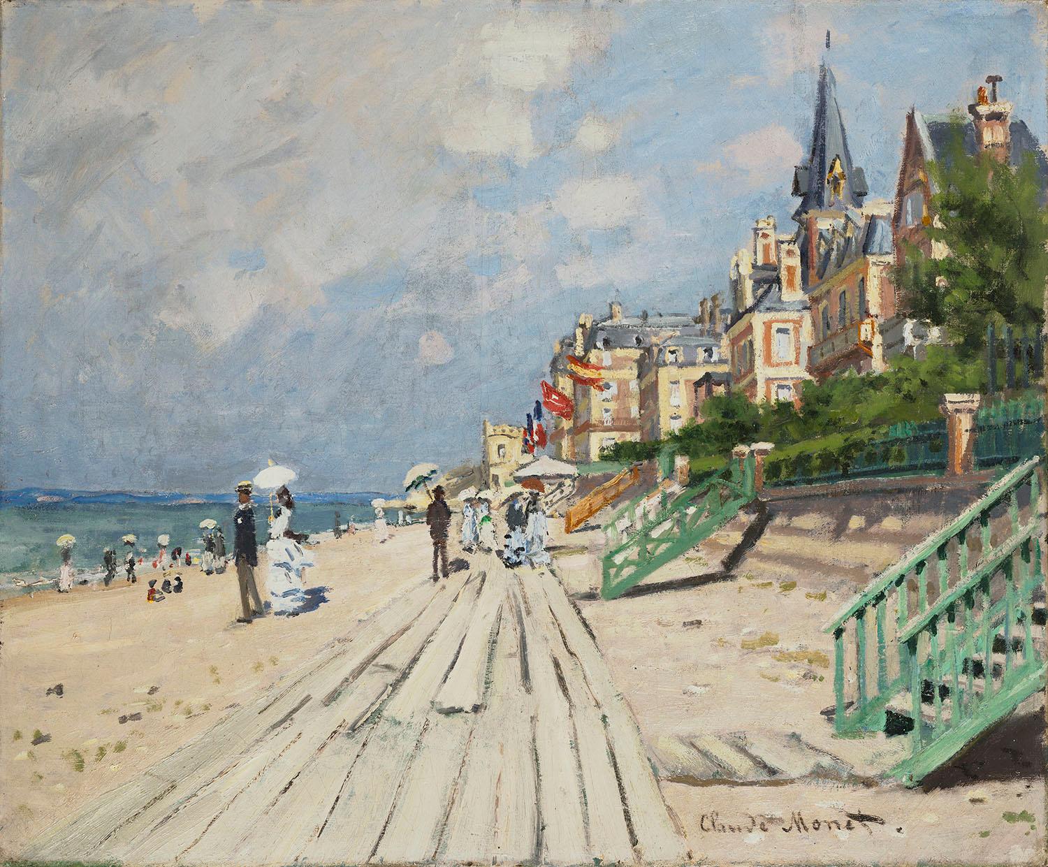
- The Complementary color formula is usually used to increase color contrast, and uses two colors which directly oppose one another on the color wheel. Yellow and purple, red and green, and blue and orange are all opposites and are used in a complementary color scheme. The hues can be mixed in various proportions, and tones added with white or black (or preferably earth.This famous painting by Monet of The Beach at Trouville (1870). was painted on the spot. Monet is here using a complementary color scheme with an orange in beach and flesh tones against chalky tints of blue pigments).
- The Natural color scheme provides more freedom in choosing colors because you can use any color combination which occurs in natural environments. Red, yellow, and green always create a harmonious design regardless of conforming to a technical scheme.
In conclusion, all artists use color in their paintings and drawing, and will not produce successful work unless some type of color harmony scheme is implemented. The important thing is to research and experiment for yourself — study the great masterworks and try out their color schemes to help understand what color scheme was used and why.
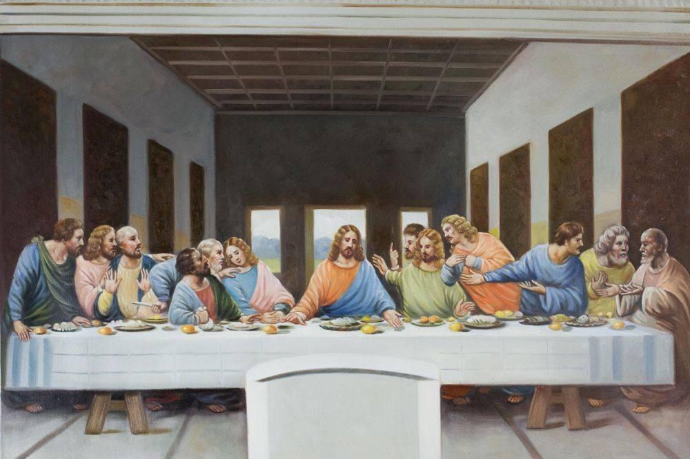
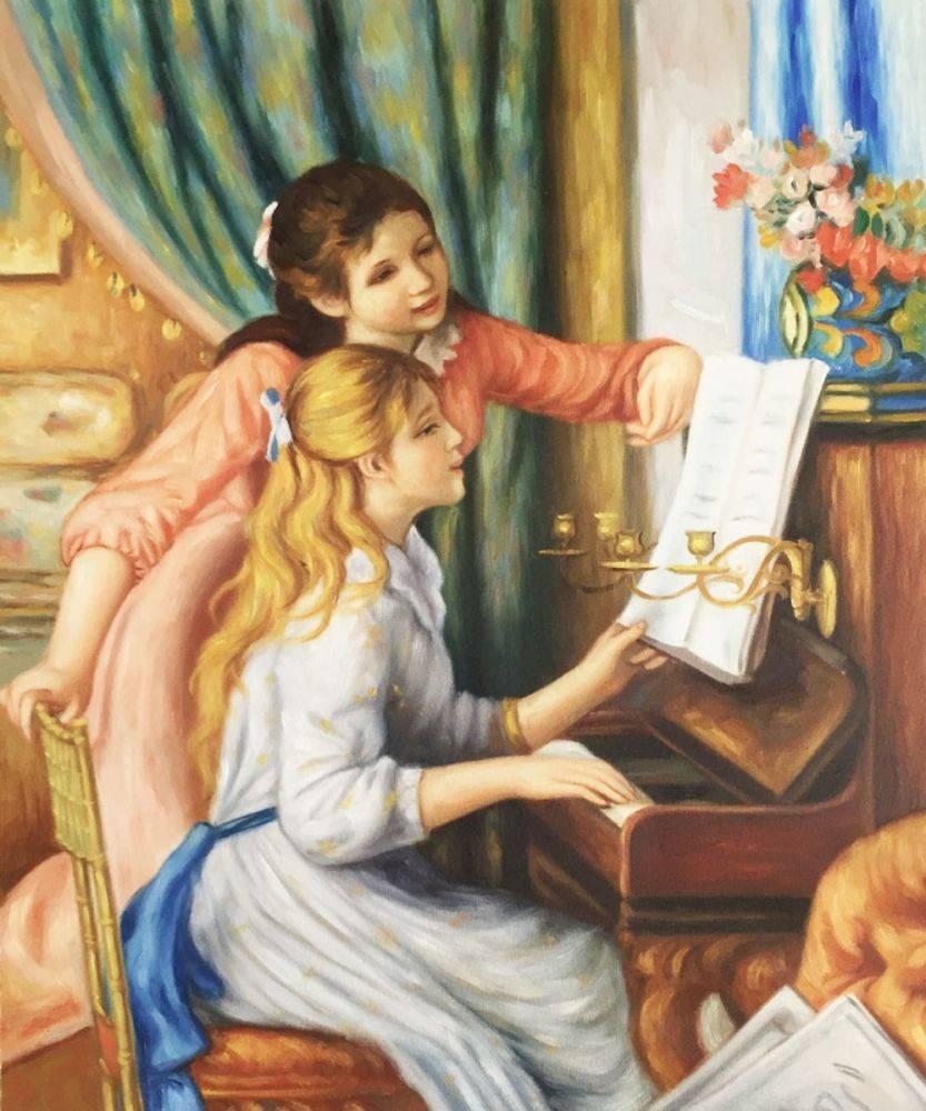
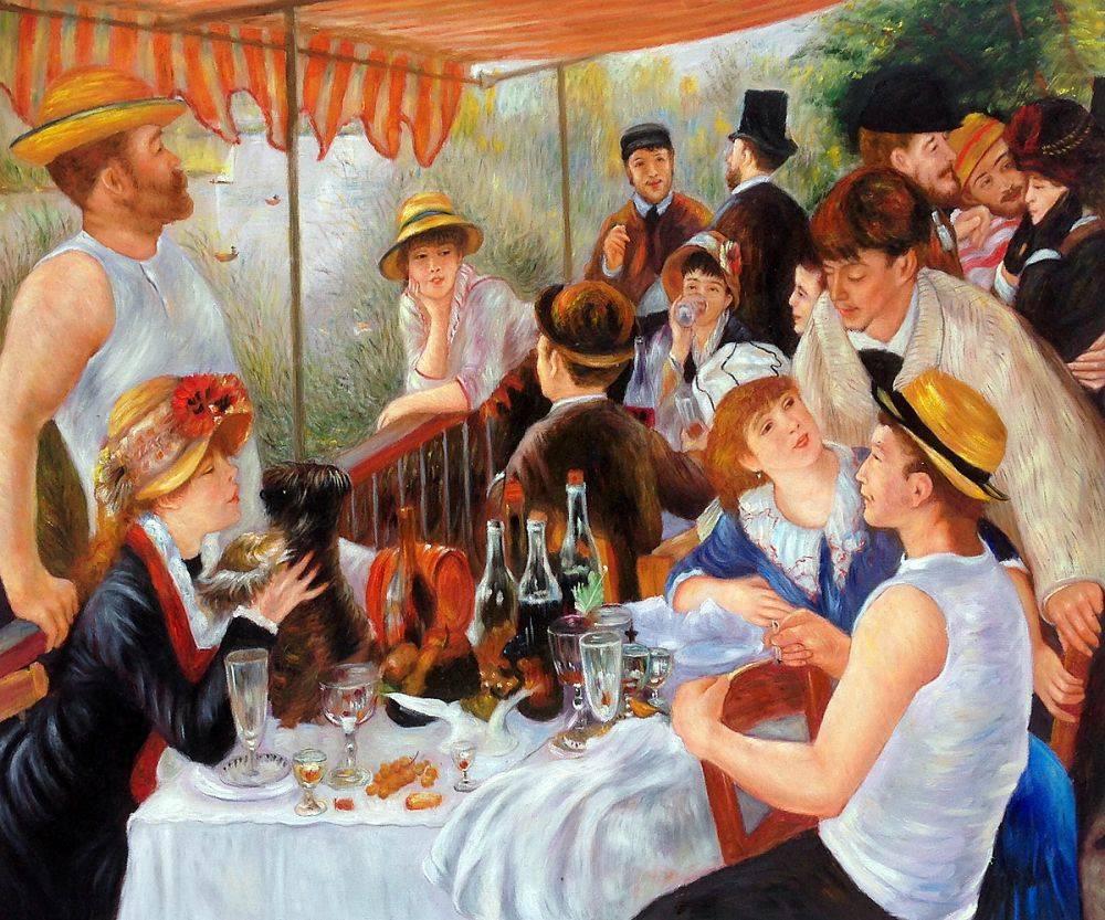
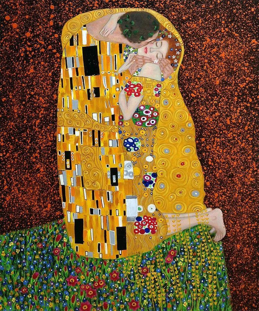
So go get ready for that date and take a look at some of the works at overstockart.com and practice recognizing harmony as a principle in art. Your date is sure to be impressed, and you will be well on your way to date three. We predict harmony in more than the composition…
About the Author Tiffany Chaney
Tiffany Chaney is a freelance writer, artist and graphic designer residing in North Carolina. In 2012, her first poetry collection Between Blue and Grey was released. Find out more about her at www.tiffanychaney.com.